My Skills
My Work
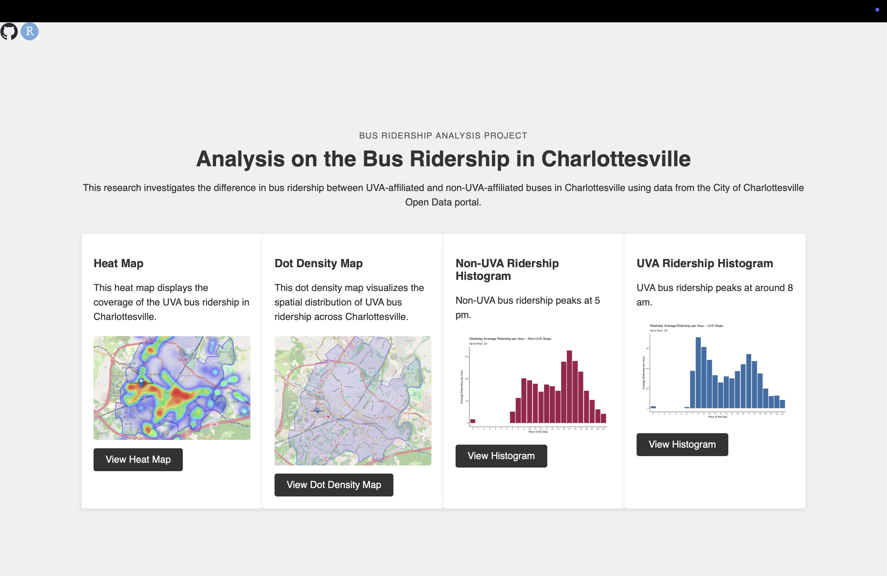
• Charlottesville Bus Ridership Analysis
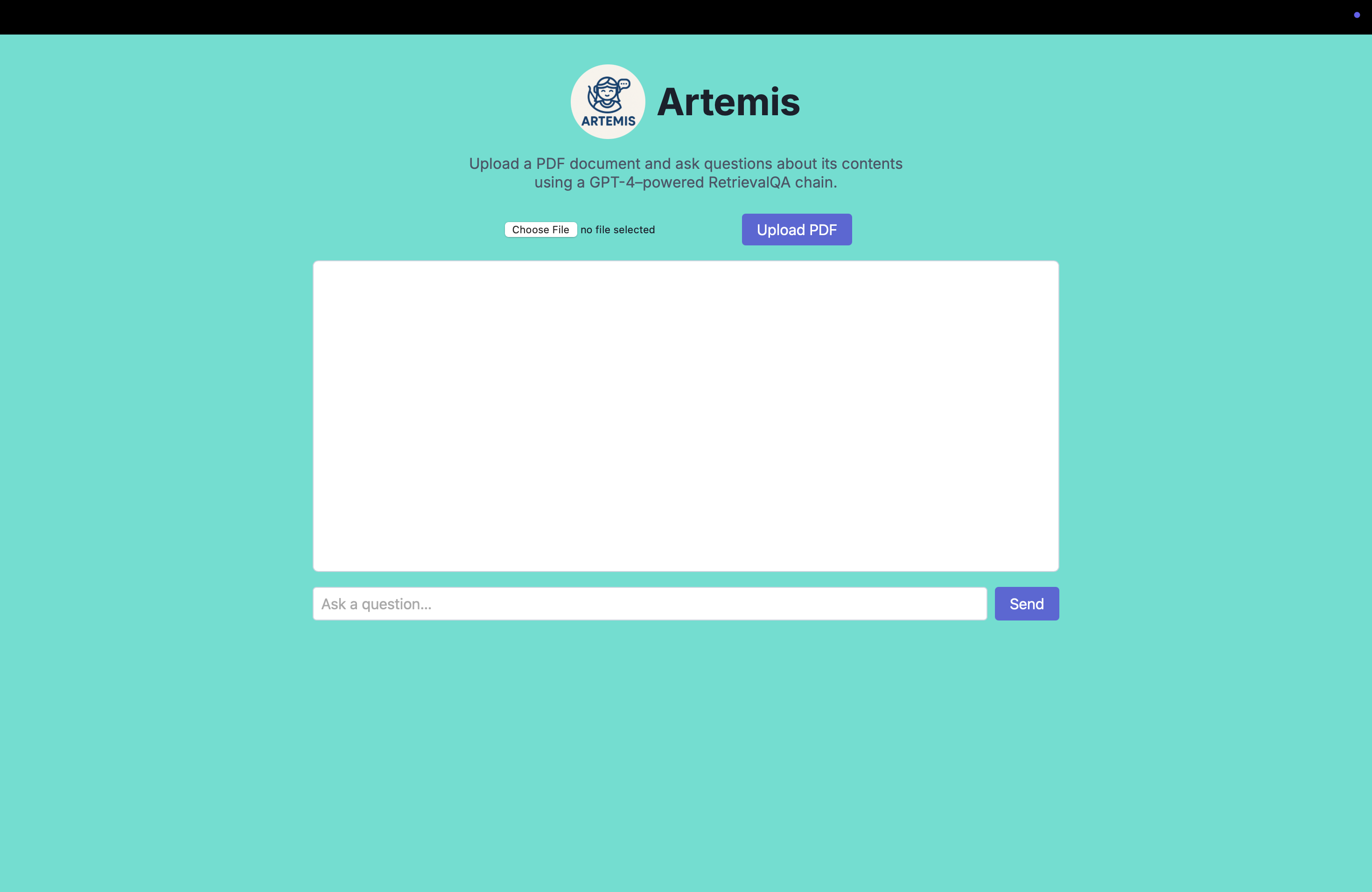
• Artemis PDF Chatbot
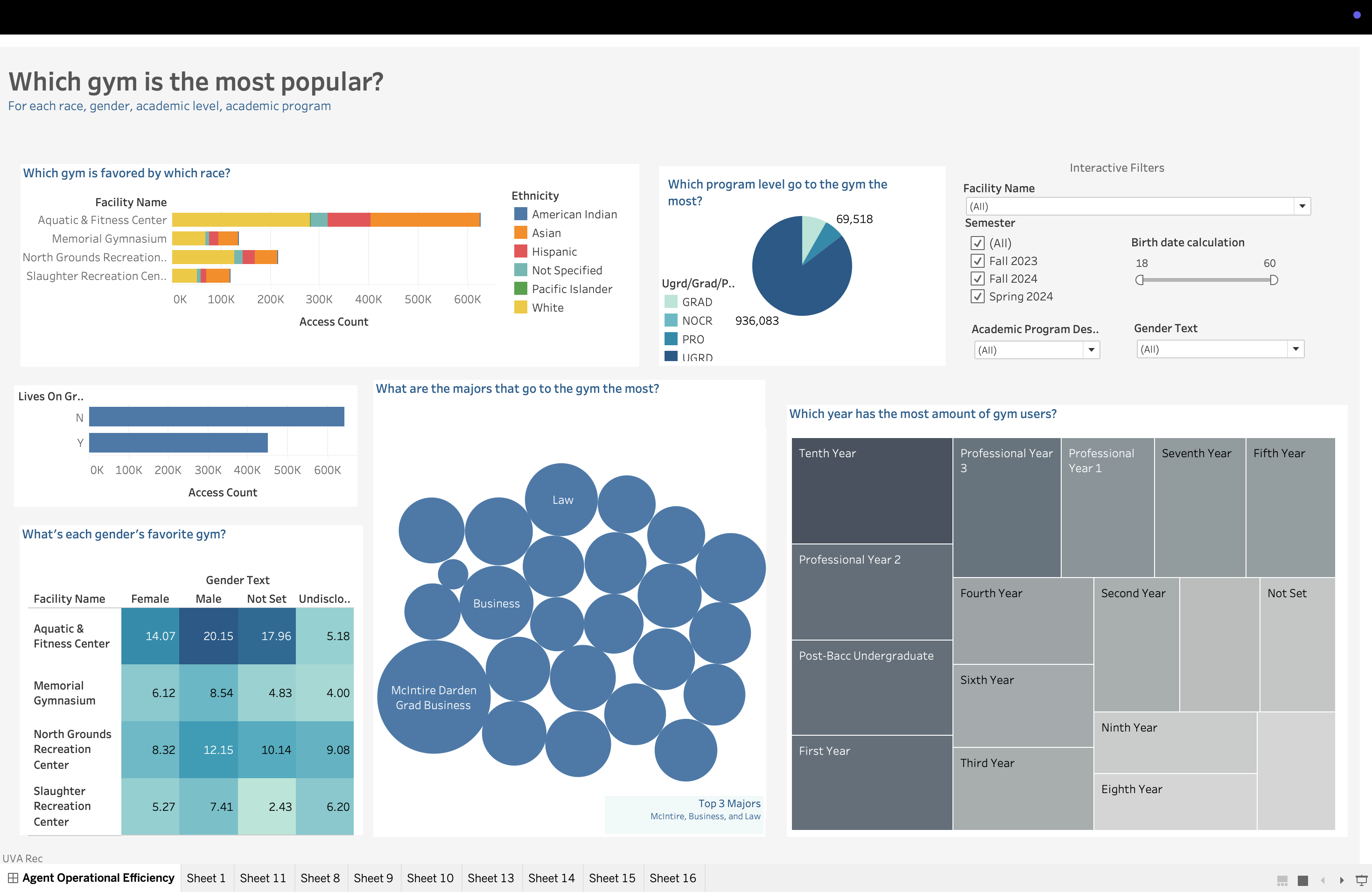
• UVA Rec Dashboard
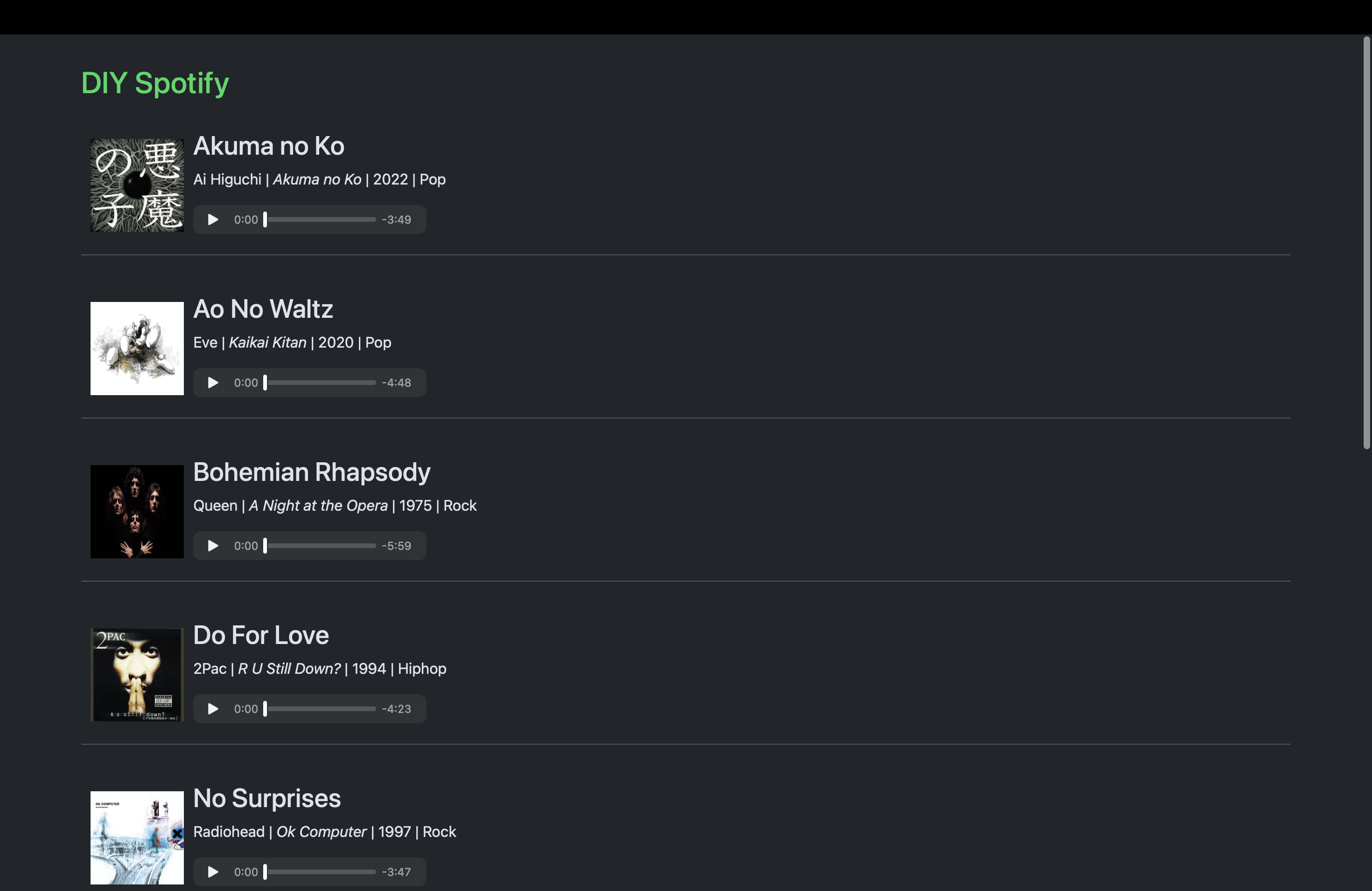
• Spotify API